NDVI — the Normalized Difference Vegetation Index — was not designed for insurance underwriting. It was developed in the 1970s as a satellite-derived proxy for photosynthetic activity, computed from the ratio of near-infrared and red reflectance. The fact that it has become one of the more reliable early-season yield signals available to agricultural risk managers is partly accident, partly physics, and partly the product of three decades of calibration work by agricultural scientists who recognized what the signal was actually capturing.
The Physics Behind the Index
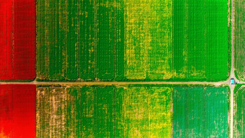
NDVI is computed as (NIR − Red) / (NIR + Red), where NIR is reflectance in the near-infrared band and Red is reflectance in the visible red band. Healthy green vegetation absorbs visible red light for photosynthesis and strongly reflects near-infrared light from leaf cellular structure. Stressed, sparse, or absent vegetation absorbs less red and reflects less NIR, shifting the ratio toward zero or below.
The range runs from approximately −0.1 (bare soil, water, or ice) to +0.9 (dense, healthy canopy). For row crops in the corn belt, peak-season NDVI values in the range of 0.75–0.85 indicate a healthy, closed canopy at or near peak greenness. Values persistently below 0.60 during the rapid growth phase (V6 through VT in corn, R1 through R5 in soy) signal stress — and stress during these periods has a direct relationship to final grain set.
The actuarial relevance is this: photosynthetic efficiency during the reproductive window determines yield. NDVI is a direct proxy for photosynthetic efficiency. That connection is not inferred from correlations — it is mechanistic.
From Pixel Value to Yield Signal: What Actuaries Need to Understand
The raw NDVI value at a single point in time has limited actuarial utility. The signal that matters is the trajectory — the NDVI time-series from planting through reproductive development, measured against the historical norm for that field or region.
Consider what happens when you plot a field's NDVI values from May through September against the 10-year historical mean for that same field polygon. Three patterns emerge with predictable yield implications:
- Early-season deficit, recovery: NDVI tracks below historical mean through V6 (late May to early June), then recovers to near-normal by silking (late June). Yield impact: typically modest, 3-8% below trend. Planting stress events rarely translate to full yield loss if reproductive development is normal.
- Early-season normal, late-season stress: NDVI tracks normal through early July, then declines sharply during pollination or grain fill. This is the classic drought-stress pattern. Yield impact: severe, 15-35% below trend depending on timing and severity.
- Season-long deficit: NDVI below historical mean from emergence through harvest, without recovery. Common in drought years or on marginal soils with poor water-holding capacity. Yield impact: 25-50% below trend in severe cases.
The practical implication for actuaries is that a single mid-season NDVI reading — say, a July 15th snapshot — carries real predictive power, but the cumulative NDVI anomaly from emergence through a critical development stage carries significantly more. Integrated NDVI (the area under the NDVI time-series curve from planting to reproductive peak) is a better yield predictor than any single-date reading.
Calibration Against Ground Truth: The NASS Bridge
NDVI as a standalone signal has limitations. It responds to canopy cover, not directly to grain yield. A lodging event that flattens a corn crop in August may produce high NDVI (green canopy is still present) while grain yield collapses. Soil brightness effects can confound NDVI on sparse early-season canopies. Different crop types at the same NDVI value represent very different yield states.
The standard approach to converting NDVI time-series into yield probability distributions involves calibrating the spectral signal against USDA NASS county yield survey data across multiple years. NASS publishes county-level corn, soybean, and wheat yield estimates annually — a public ground-truth dataset that, while noisy at the county level, provides the supervised labels needed to train spectral-to-yield relationships.
A practical calibration workflow might look like this: for a given county, extract the cumulative NDVI anomaly for corn fields across each growing season from 2016 to 2024. Pair each season's anomaly with the NASS county yield deviation from trend for that year. Fit a regression (or gradient-boosted model) that maps cumulative NDVI anomaly to expected yield deviation. The result is a calibrated yield forecast function that can be applied in real-time as the growing season progresses.
The calibration is never perfect. County-level NASS data aggregates field-level heterogeneity, introducing noise into the training labels. But across 8-10 years of training data, the signal is consistent enough to produce yield forecasts with meaningful accuracy at the county and regional level — and materially better accuracy at the field level when field-specific historical NDVI baselines are available.
What NDVI Doesn't Tell You (And What Fills the Gap)
We should be direct about the limitations actuaries need to account for:
NDVI is an optical signal. Cloud cover blocks optical satellite imagery. A cloudy week during pollination — exactly the period where NDVI stress information is most valuable — produces no data. This is the cloud-gap problem, and it requires temporal compositing across multiple satellite passes and potentially multi-sensor fusion with radar to address.
NDVI doesn't capture root-zone water status directly. A field with high NDVI in July but critically depleted soil moisture profile may be weeks away from stress that hasn't yet appeared in the canopy signal. Integrating SWIR (shortwave infrared) bands — specifically band ratios like NDWI (Normalized Difference Water Index) — provides earlier warning of pre-visual water stress.
NDVI saturates at high biomass. Above approximately 0.80-0.85 for row crops, the index becomes insensitive to further increases in leaf area index. For purposes of detecting stress (loss of NDVI from a high baseline), this matters less — a drop from 0.82 to 0.70 is meaningful even if the absolute values near peak are compressed. But for early-season canopy establishment signals, EVI (Enhanced Vegetation Index) or other indices may outperform NDVI.
We're not saying these limitations make NDVI unsuitable for actuarial applications — they demonstrably don't. The signal is strong enough that even with these caveats, NDVI-based yield forecasts have outperformed county-average actuarial assumptions in back-tested validation across most major corn belt counties. What we're saying is that a production-grade yield forecasting system for insurance applications needs to treat NDVI as a primary signal in a multi-variable model, not a standalone answer.
A Practical Example: How an Actuary Should Read the Signal
Imagine it's July 20th, mid-season. An underwriting team is reviewing a portfolio of 400 enterprise-unit corn policies in central Illinois. The NDVI time-series for the insured field polygons shows cumulative NDVI anomaly averaging −0.12 versus the 2016–2024 field mean, with the deficit concentrated in the last three weeks coinciding with a documented heat and drought event.
A calibrated yield model trained on NASS ground truth for this region translates that cumulative anomaly to a P50 yield estimate of approximately 165 bu/acre against a historical county trend of 190 bu/acre — a 13% deficit. P10/P90 bounds (the 10th and 90th percentile of the yield distribution at this point in the season, given the NDVI trajectory observed) run from approximately 148 to 183 bu/acre. The insured APH for this portfolio averages 185 bu/acre.
With this information, an actuary can estimate portfolio expected loss at the field level, identify which specific insured fields are tracking at the highest loss probability, and adjust reserves accordingly — all six to eight weeks before harvest, before a single combine has moved. That is the actuarial value of NDVI properly calibrated and integrated into the rating workflow.
The signal has been available for decades. What's changed is the spatial resolution — 10-meter multispectral imagery from modern satellite constellations versus 250-meter MODIS data that was state-of-the-art for agricultural remote sensing a decade ago — and the processing infrastructure that can deliver calibrated yield estimates via API to a non-GIS actuary on the same timeline as market data feeds. That combination is what makes NDVI useful at the underwriting desk, not just in academic papers.